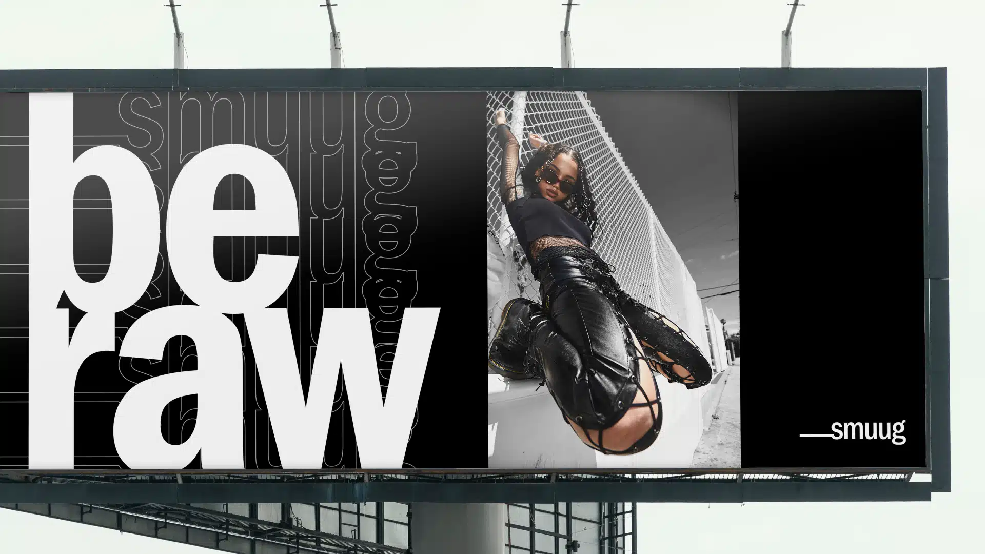
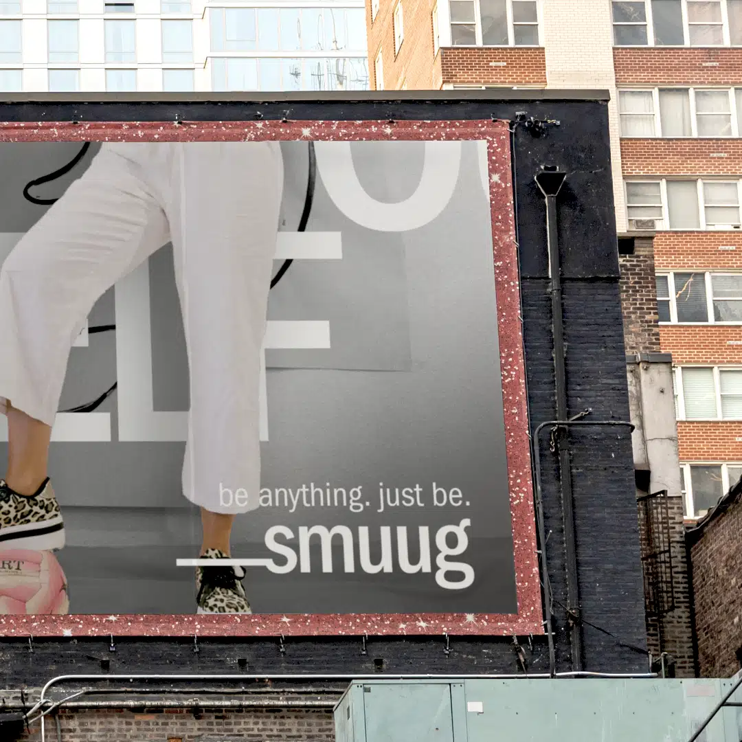
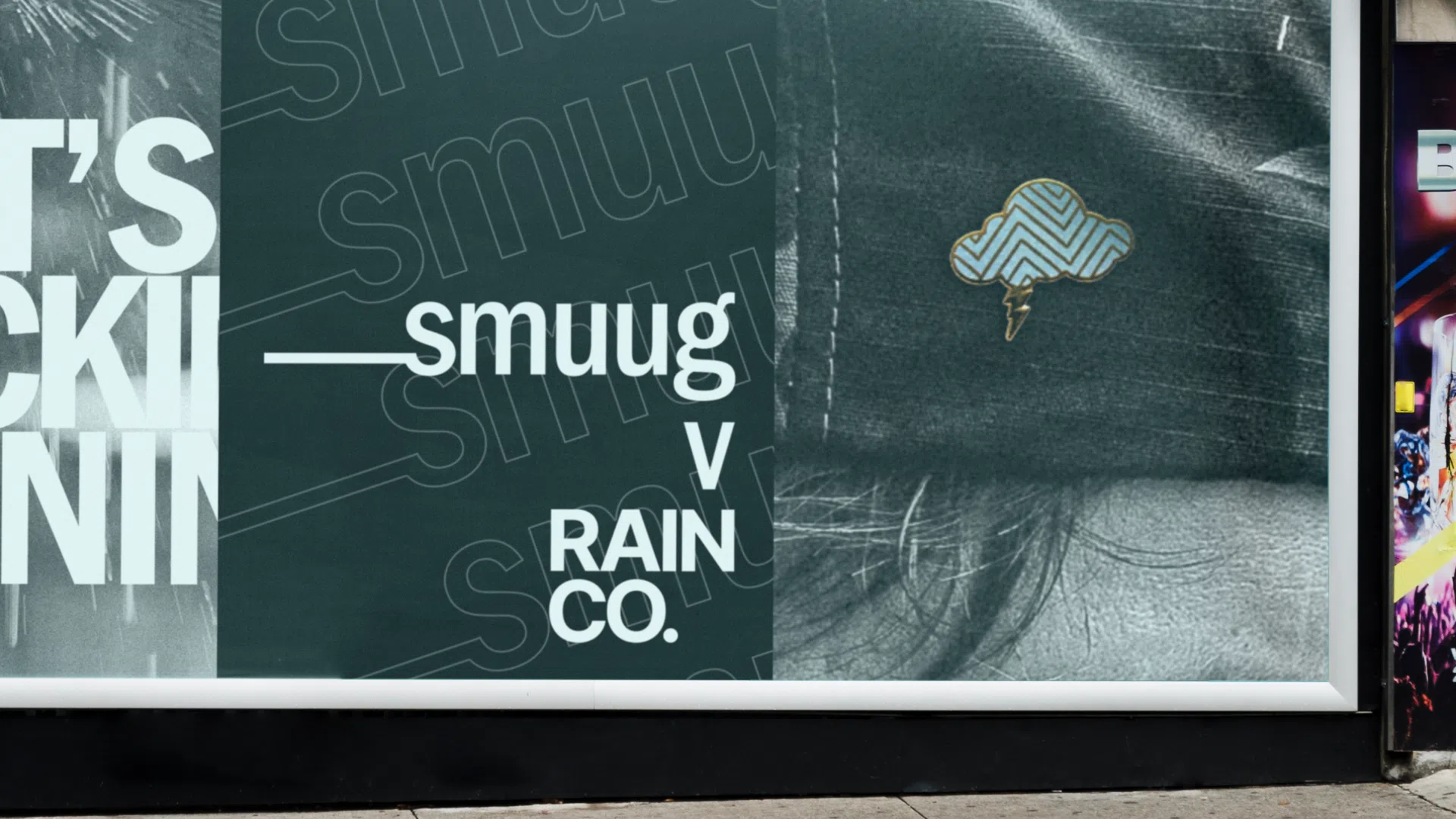
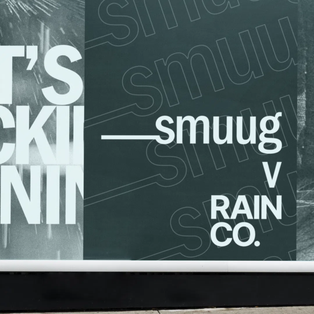
our logo is our rep. we work hard to make sure that wherever people see it, they see us. Don’t mess with our rep.
in practical terms this means only use our logo in the ways shown in this styleguide.
If it isn’t in this guide, don’t do it. or else.
there are only two versions of our logo;
this one ↓
that’s it. no other choices. if you see it somewhere and it isn’t one of these two, don’t copy it (even if you think it looks cool), and let us know where you saw it.
These are some of the things you shouldn’t do to our logo ↓
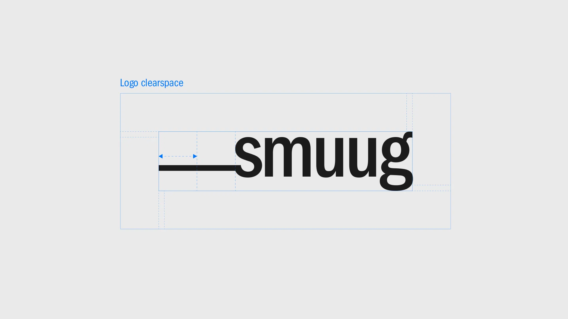
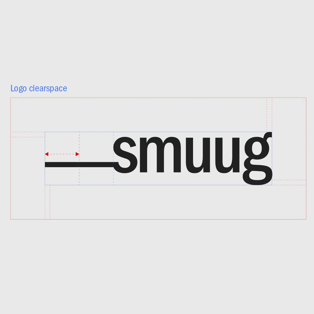
we also have a forcefield around our logo to repel any aliens (otherwise known as clearspace). This barrier prevents anything obscuring our logos visibility.
The Clearspace is equal to half the width of the logo underscore.
Whilst there are rules that restrict how our logo can be used, we do like to have fun with it in other ways. Like these cool patterns ↓
but you should only use the patterns in the preset formats we provide. here’s an example of how we use patterns ↓
Type is a really important part of our look. we use it to create a unique style.
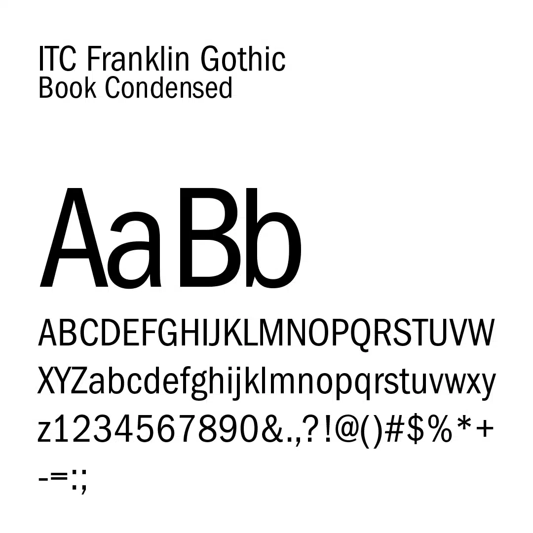
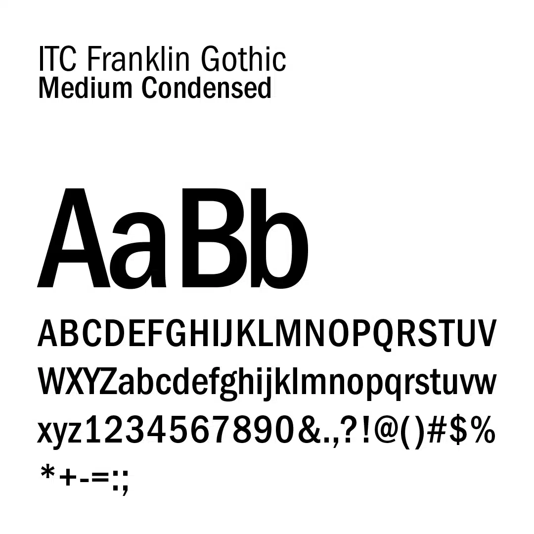
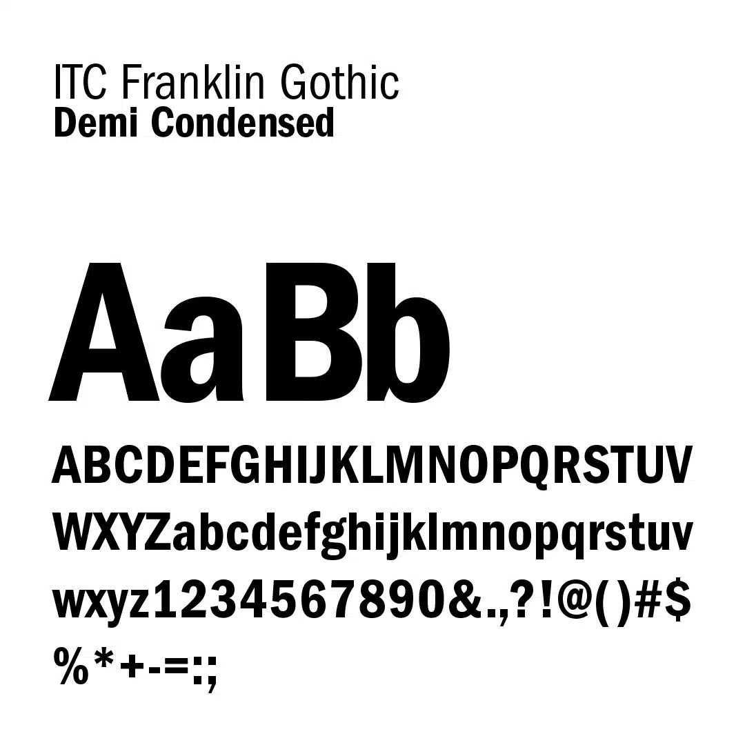
to keep things simple (and consistent) we only use a single typeface – ITC Franklin Gothic Condensed.
from this typeface family, we use three font weights; book, medium, and demi. check them out ↓
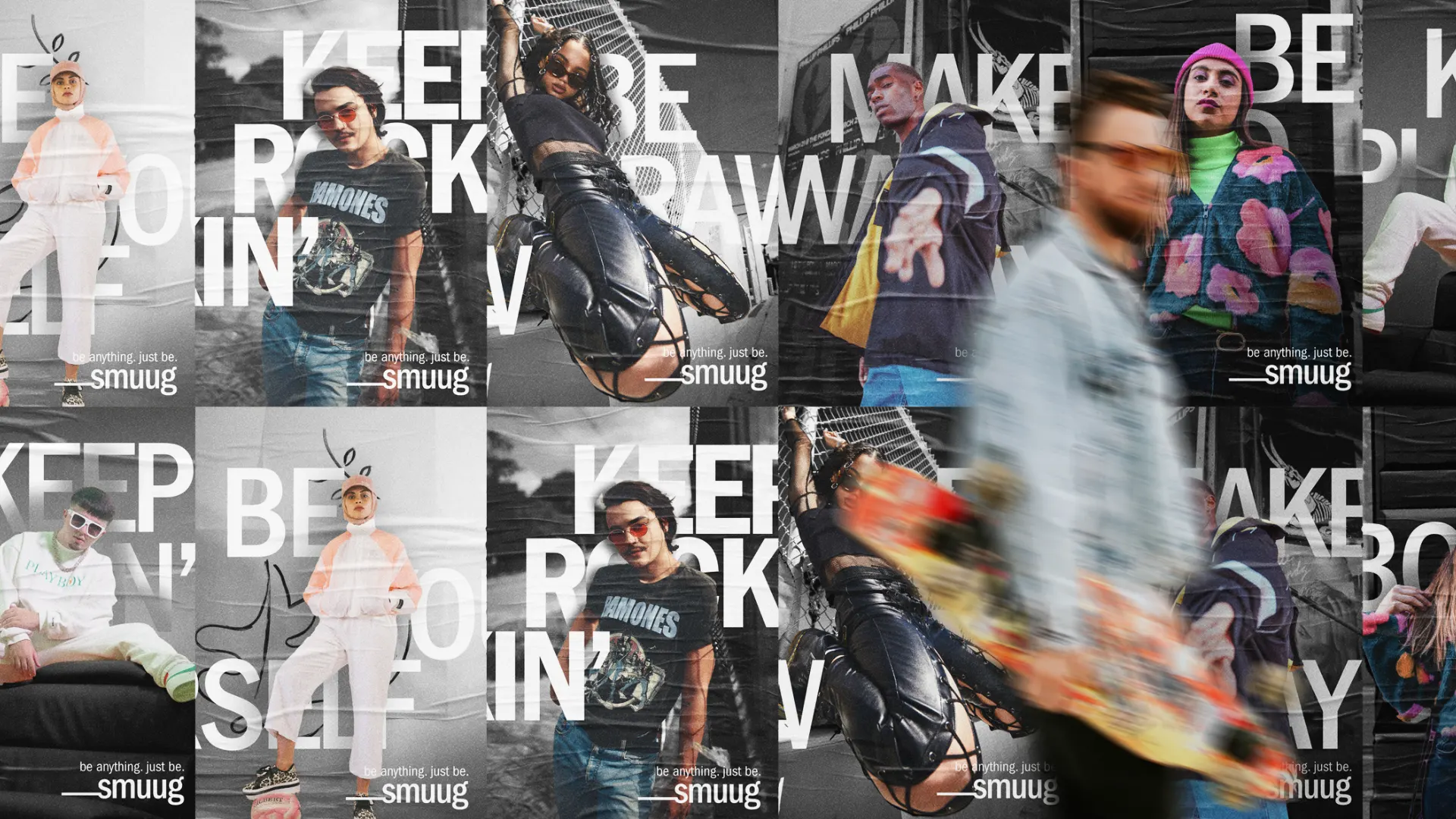
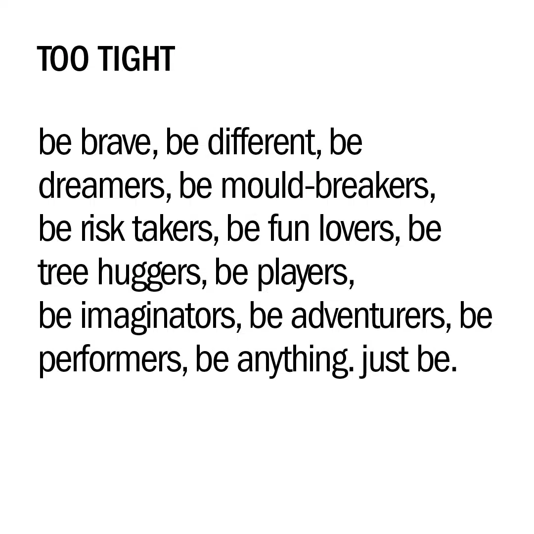
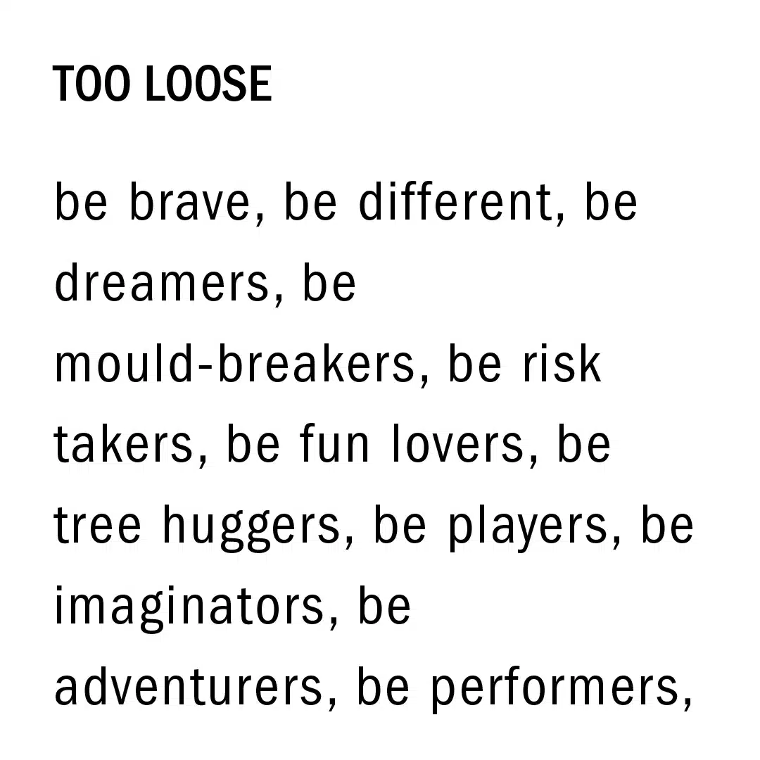
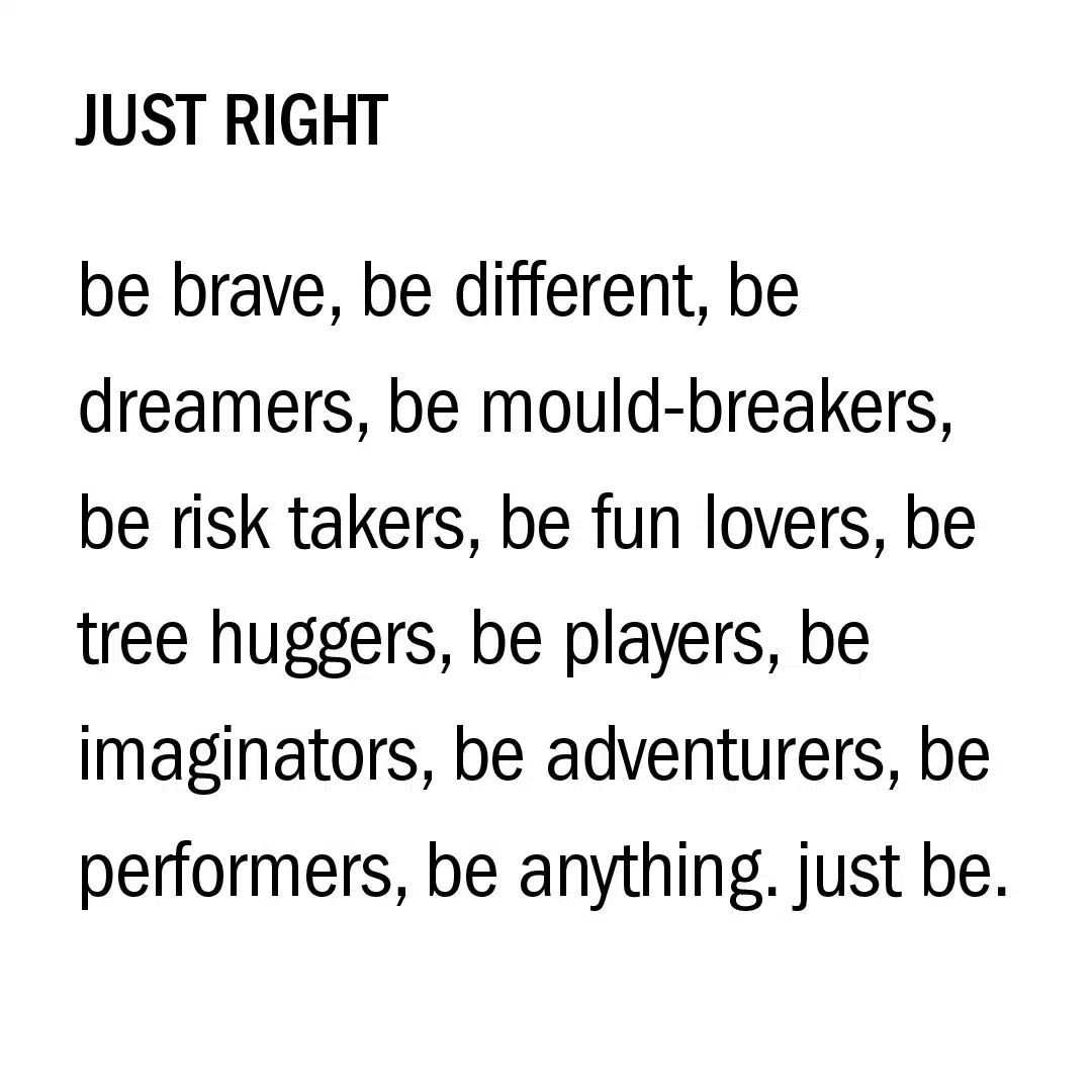
Now you know which fonts we use, let’s show you how we like to use them. ↓
we like our messages loud and clear, so we tend to use uppercase quite a bit.
And we always make certain to distinguish between titles and subtitles using different font weight and size combinations.
